Replicating WEGO Plots using ggplot2
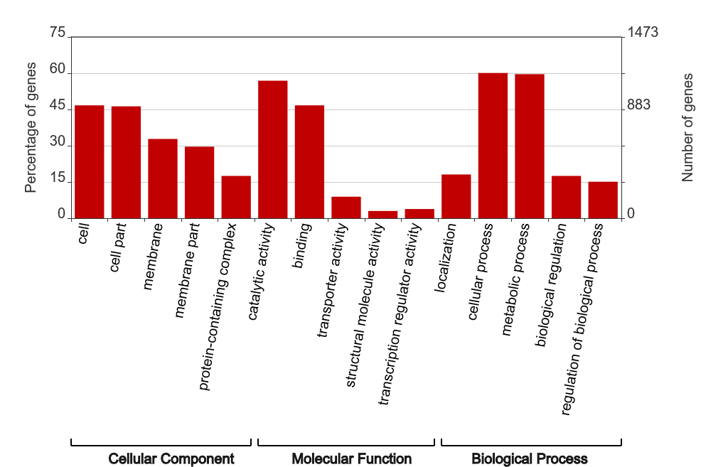
WEGO (Web Gene Ontology Annotation Plot) is a tool for visualizing, comparing, and plotting gene ontology (GO) annotation results. WEGO accepts various file formats, including GAF, XML, and TXT, making it compatible with BLAST2GO. It has an intuitive interface and produces satisfactory images like this:

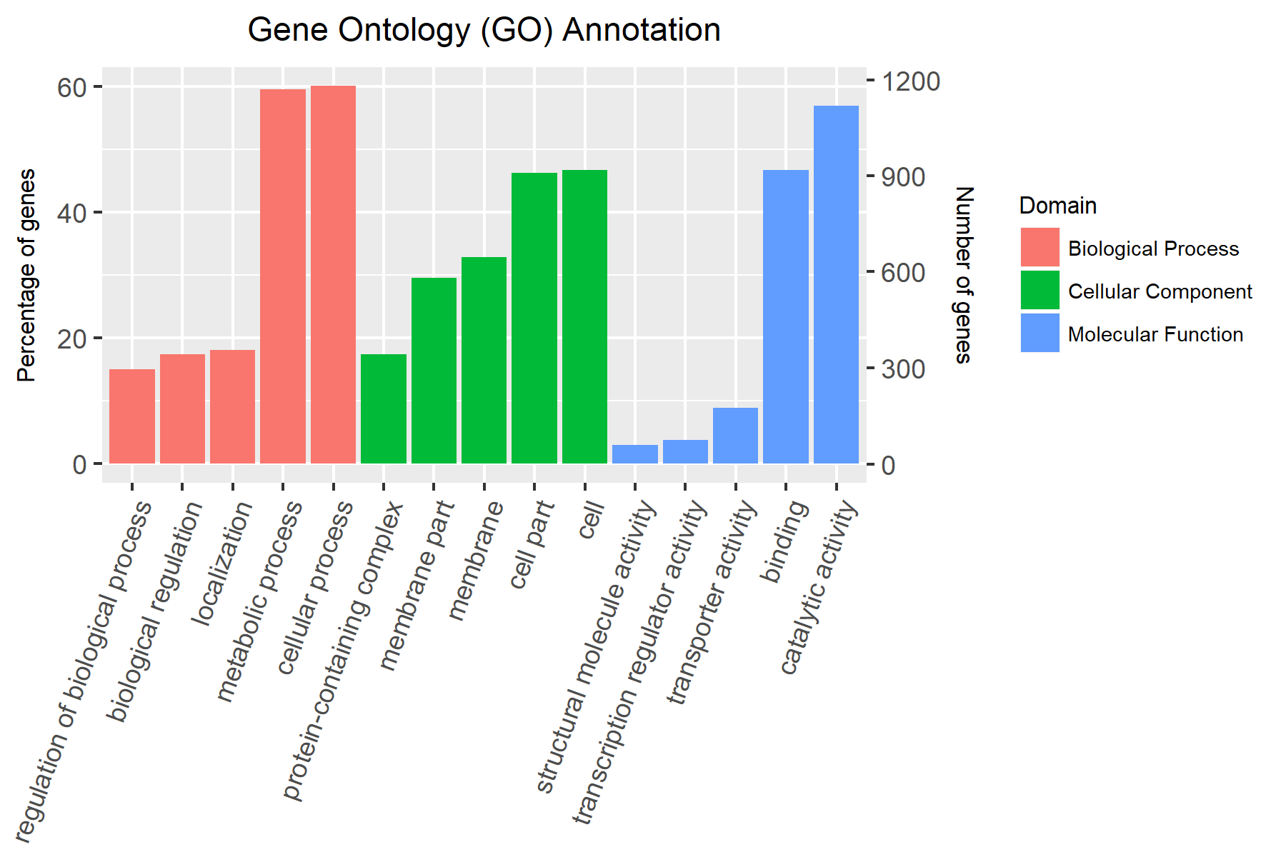
Although most of WEGO’s features are neat, I found myself yearning for other subtler features, such as being able to sort the terms according to the number/percentage of genes or to automatically select the top n terms in each domain. Knowing that the only way I can attain exactly what I want is to do the visualization myself, I just exported the TSV file from WEGO and proceeded to let my fingers do all the work. The script can be divided into three parts:
Reading the WEGO TSV file
> library(dplyr)
> library(ggplot2)
> library(forcats)

> WEGO <- read.table("./WEGO_output.tsv", header = FALSE, sep = "\t")
> head(WEGO)
          V1                 V2  V3   V4 V5             V6
1 GO:0043226 Cellular Component 143  7.3 Ml      organelle
2 GO:0005623 Cellular Component 917 46.7 Ml           cell
3 GO:0044464 Cellular Component 909 46.3 Ml      cell part
4 GO:0044422 Cellular Component  71  3.6 Ml organelle part
5 GO:0016020 Cellular Component 645 32.8 Ml       membrane
6 GO:0044425 Cellular Component 582 29.6 Ml  membrane part

## Assign column names
> colnames(WEGO) <- c("ID", "Domain", "Number of genes", "Percentage of genes", "Ml", "Description")
> head(WEGO)
          ID             Domain Number of genes Percentage of genes Ml    Description
1 GO:0043226 Cellular Component             143                 7.3 Ml      organelle
2 GO:0005623 Cellular Component             917                46.7 Ml           cell
3 GO:0044464 Cellular Component             909                46.3 Ml      cell part
4 GO:0044422 Cellular Component              71                 3.6 Ml organelle part
5 GO:0016020 Cellular Component             645                32.8 Ml       membrane
6 GO:0044425 Cellular Component             582                29.6 Ml  membrane part
Preparing the table for plotting
> WEGO2 <- WEGO %>%
+   ## Group the entries by "Domain"
+   group_by(Domain) %>%
+   ## Take the top 5 entries per "Domain" according to "Percentage of genes"
+   top_n(5, `Percentage of genes`) %>%
+   ## Ungroup the entries
+   ungroup() %>%
+   ## Arrange the entries by "Domain", then by "Percentage of genes"
+   arrange(Domain, `Percentage of genes`) %>%
+   ## Take note of the arrangement by creating a "Position" column
+   mutate(Position = n():1)

> head(WEGO2)
# A tibble: 6 x 7
          ID             Domain `Number of genes` `Percentage of genes`     MI
      <fctr>             <fctr>             <int>                 <dbl> <fctr>
1 GO:0050789 Biological Process               296                  15.1     Ml
2 GO:0065007 Biological Process               343                  17.5     Ml
3 GO:0051179 Biological Process               355                  18.1     Ml
4 GO:0008152 Biological Process              1171                  59.6     Ml
5 GO:0009987 Biological Process              1181                  60.1     Ml
6 GO:0032991 Cellular Component               343                  17.5     Ml
# ... with 2 more variables: Description <fctr>, Position <int>
Actual plotting
> ## Calculate the normalizer to make "Number of genes" proportional to
> ## "Percentage of genes" for the plotting of the second y-axis
> normalizer <- max(WEGO2$`Number of genes`)/max(WEGO2$`Percentage of genes`)
>
> ## Plot "Description" in the x-axis following the order stated in the "Position" column
> ## vs "Percentage of genes" in the first y-axis
> p <- ggplot(data = WEGO2, aes(x = fct_reorder(Description, desc(Position)), y = `Percentage of genes`, fill = Domain)) +
+   ## Plot "Description" in the x-axis following the order stated in the "Position" column
+   ## vs normalized "Number of genes" in the second y-axis
+   geom_col(data = WEGO2, aes(x = fct_reorder(Description, desc(Position)), y = `Number of genes`/normalizer)) +
+   ## Add a second y-axis based on the transformation of "Percentage of genes" to "Number of genes".
+   ## Notice that the transformation undoes the normalization for the earlier geom_col.
+   scale_y_continuous(sec.axis = sec_axis(trans = ~.*normalizer, name = "Number of genes")) +
+   ## Modify the aesthetic of the theme
+   theme(axis.text.x = element_text(angle = 70, hjust = 1), axis.title.y = element_text(size = 8),
+         legend.text = element_text(size = 7), legend.title = element_text(size = 8),
+         legend.key.size =  unit(0.2, "in"), plot.title = element_text(size = 11, hjust = 0.5)) +
+   ## Add a title to the plot
+   labs(x = NULL, title = "Gene Ontology (GO) Annotation")
>
> p
The final plot

What did I learn from the process?
- Use of
top_n()from thedplyrpackage to select the topnrows according to a variable - Use of
fct_reorder()from theforcatspackage to order a factor according to another variable - Use of
sec_axisand a normalizer to specify a secondary axis
Leave a Comment